Instant Results
My role: Product Designer on Customer Experience team / Timeframe: April - June 2018
The team: 1 Product Designer, 4 Engineers, 1 PM, 1 Data Scientist, 1 Researcher, 1 Content Designer

Creating the best app for homeowners to find local pros.
The core problem is that it’s very difficult and time-consuming for homeowners to find and contact available professionals on web.
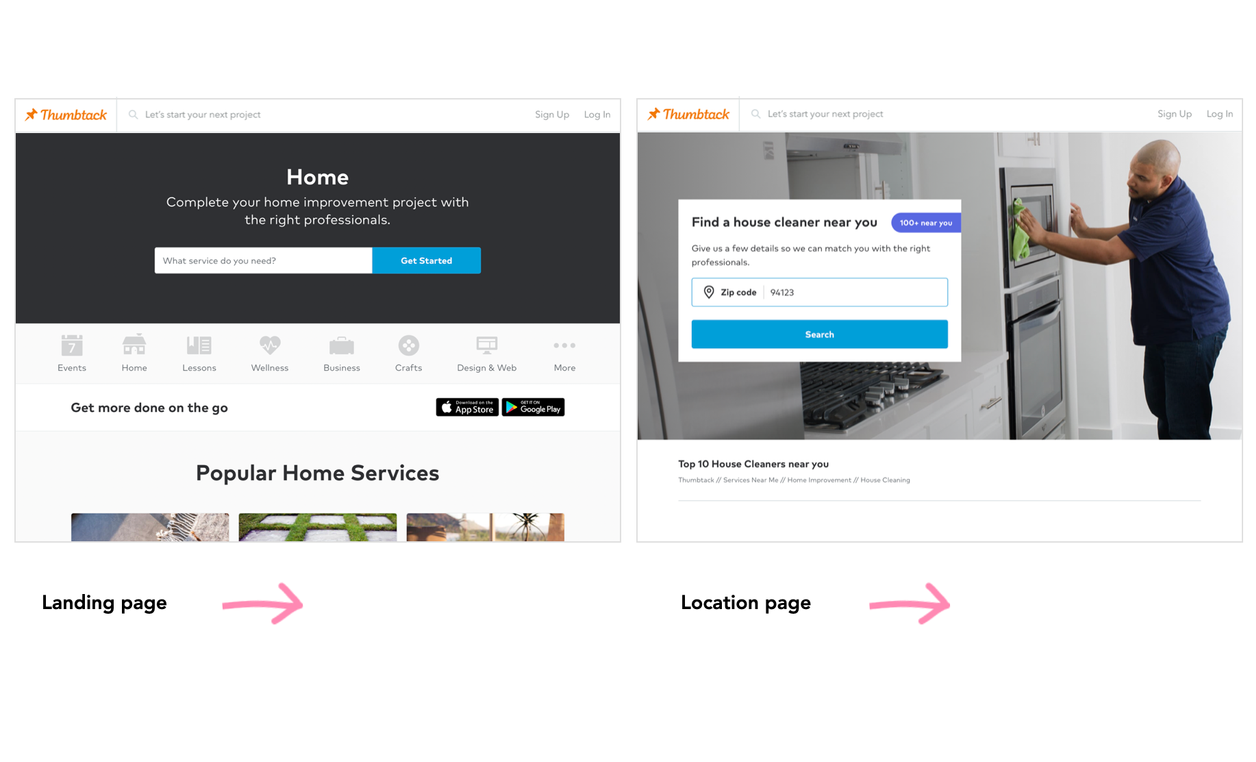
Thumbtack needed to evolve from a slow web-only ‘request a quote’ model to an instant experience to connect homeowners with quality professionals such as electricians and contractors for home projects.
Product Designer | 2 months
Introducing: A native app for customers to search and contact local pros instantly.


We successfully launched the product to 8 categories within 2 months. Shortly after, we rolled out the experience to 100% of categories.
✅ 28% increase in contacts week over week
✅ 16% increase in conversations from the previous MVP
Process preview
We lacked deep understanding in what customers need, so I worked with a researcher and conducted interviews with customers to better understand their frustrations and pain points. We learned it’s challenging to search for what they need, evaluate and compare pros, and navigate between categories.
✅ 80% of iOS customers who visit the pro list view a profile, and these customers visit more profiles than web customers
✅ Design influence: My work set a strong future vision and shaped the roadmap for several quarters


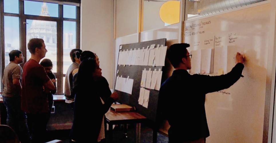
I led a design sprint to create a vision and build alignment with xfn partners. We mapped the customer journey and discussed: What UX gaps and inefficiencies in the flow are causing customer pain points? What are areas we want to focus on to bring this product to the next level? What iOS and Android platform specific possibilities and constraints are there?
It was important to showcase pros on the list without overwhelming customers with too many options. To help customers narrow in on what they’re looking for, filters allow customers to add details about their project. Tags such as “In high demand” help customers evaluate pros as they scroll through the list.
The app surfaces recommendations and encourages browsing categories. I created a quick prototype and provided it to eng. During implementation we worked closely together to address error handling and cover all possible edge cases and states.
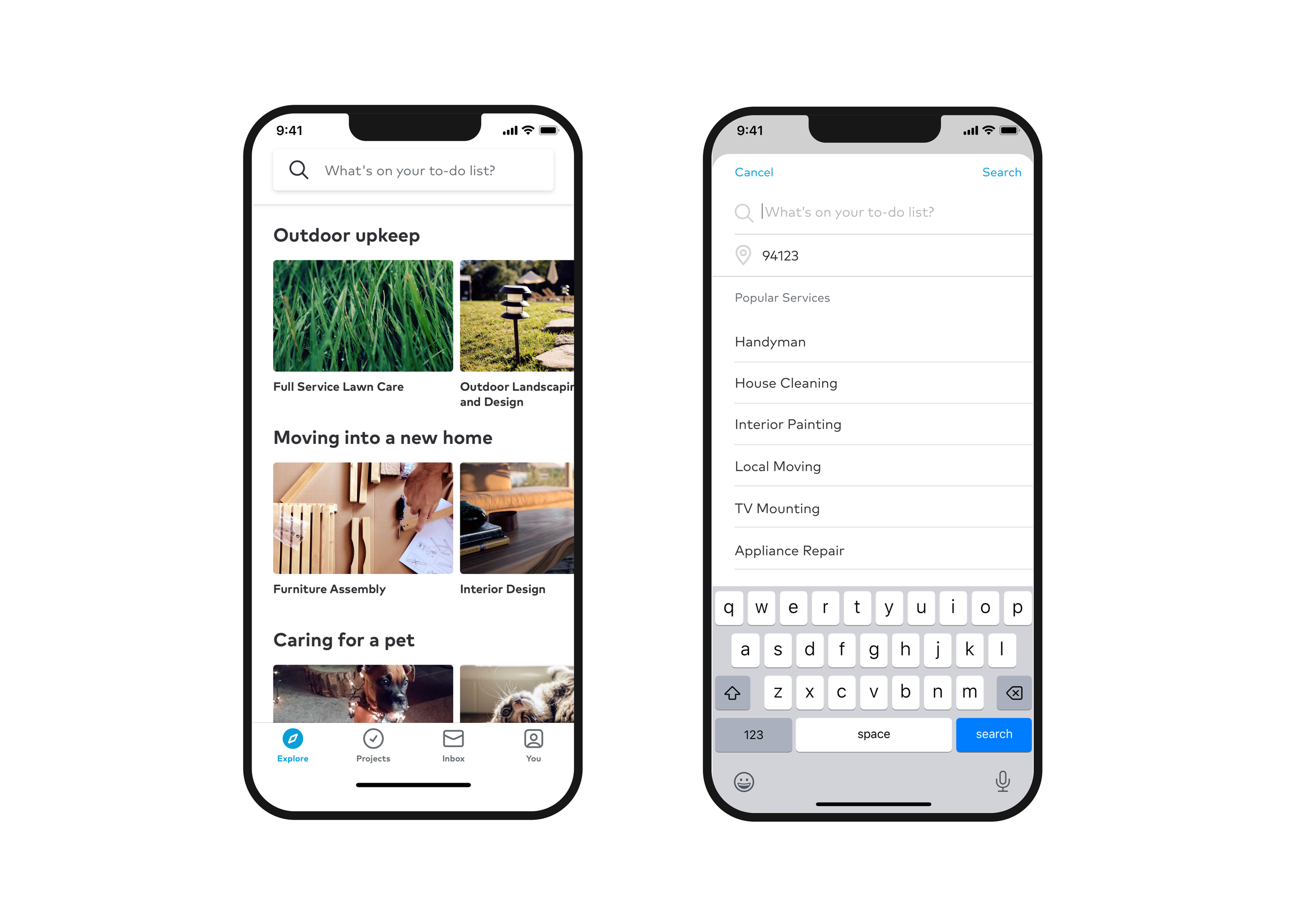


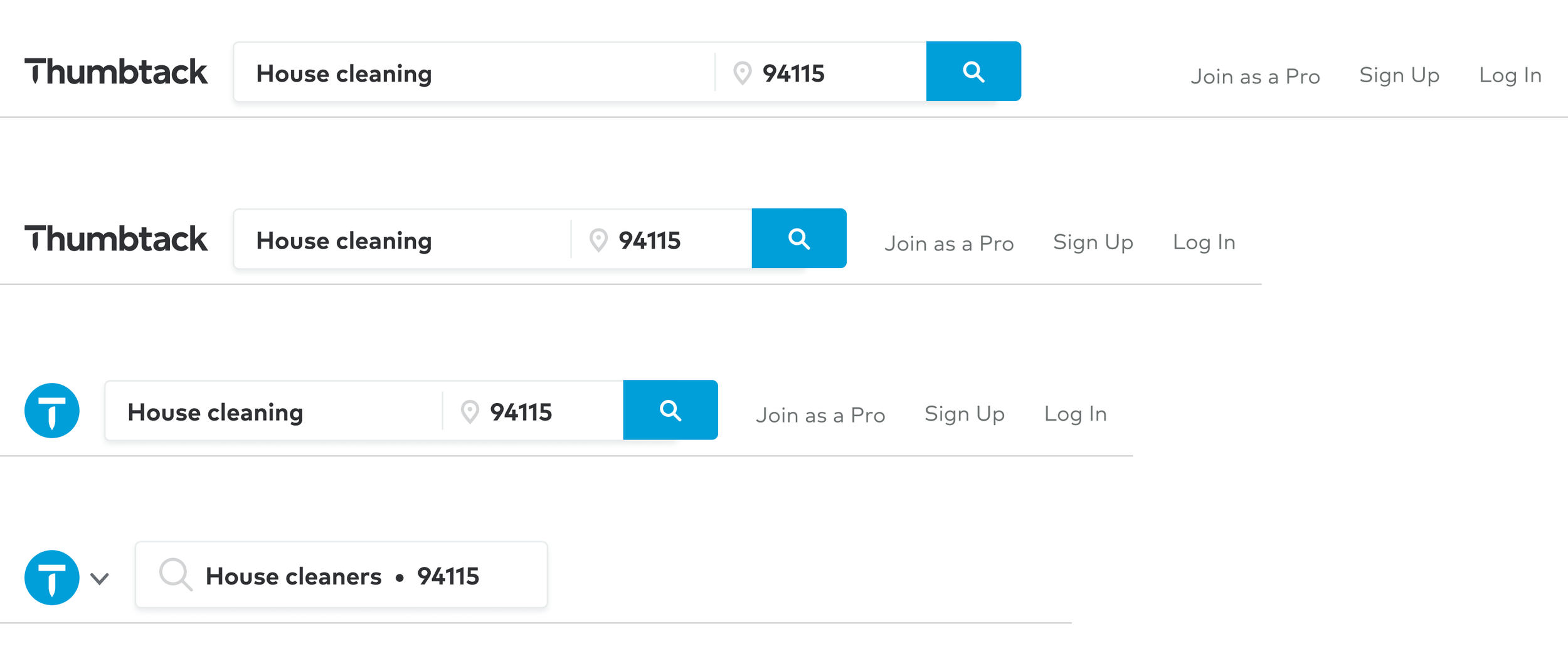
I prototyped the search experience and mapped out various states and the edge cases, which was a collaborative process with eng. My designs added location to the search bar, allowing customers to easily navigate across categories. I designed the updated search experience for web, mobile web, native iOS and Android platforms.

My goal was to connect customers with pros quickly and efficiently, ensuring they can seamlessly find what they’re looking for without unnecessary friction. The profile is formatted to showcase the pro’s skillset and specialties.
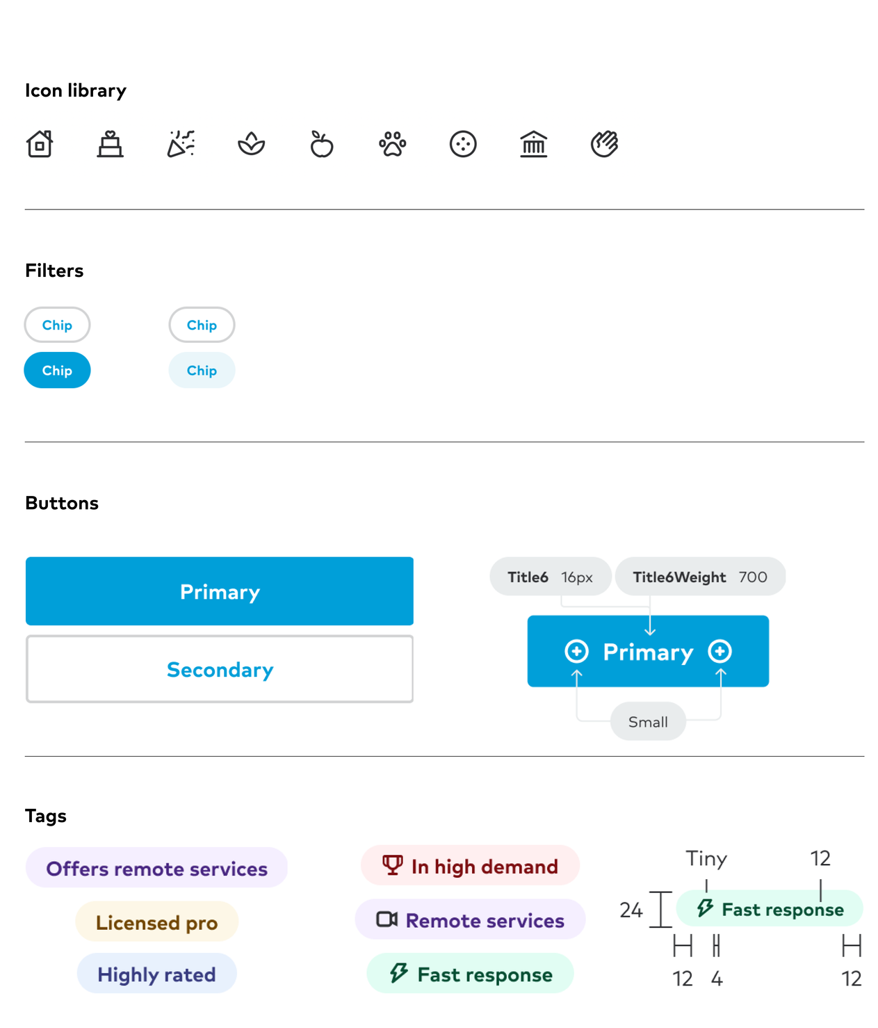
I designed components for our new design system and defined core components and details for icons, spacing, sizing, and color, ensuring accessibility requirements were met.